


Adobe Photoshop
- http://onesetia82.wordpress.com/2011/12/22/cara-membuat-huruf-efek-air-dengan-photoshop/
- http://www.ilmugrafis.com/photoshop_foto5.php
- http://bayuidea.blogspot.com/
- http://jasapembuatanblog-murah.blogspot.com/2012/05/membuat-menu-drop-down-blogspot-bagian2.html
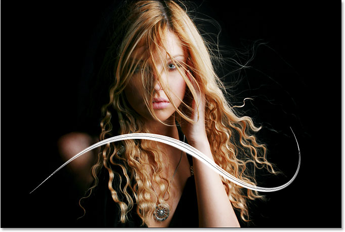
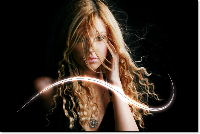
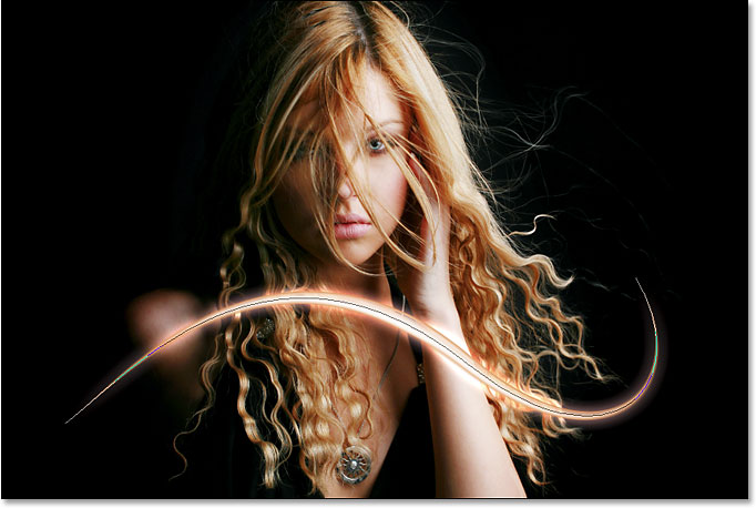
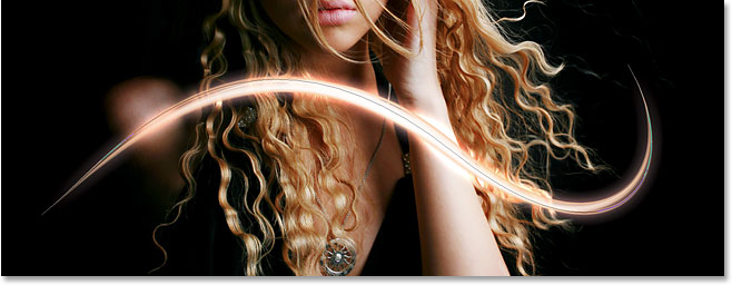
Add Light Streaks To A Photo With Photoshop
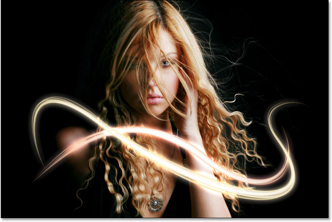
The final effect.
Let’s get started!
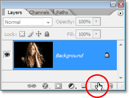
Step 1: Add A New Blank Layer
We’re going to be adding our light streaks on their own separate
layer, so the first thing we need to do is add a new blank layer to our
document. To do that, click on the New Layer icon at the bottom of the Layers palette:
Click directly on the words Shape Dynamics on the left of the Brushes palette, directly below “Brush Tip Shape”. Make sure you click directly on the words, not just in the checkbox to the left of the words. Clicking inside the checkbox will enable the Shape Dynamics options but won’t allow us to change any of them. We need to click on the words themselves to get access to the options. Once you’ve clicked on the words, you’ll see the Shape Dynamics options appear on the right of the palette. At the very top, you’ll see the words "Size Jitter" with a slider bar, and directly below the slider bar is the Control option. This is where we get to decide how to control the size of our brush. We want Photoshop to simulate pen pressure, so select Pen Pressure from the Control drop-down menu:
To save a path, all we need to do is rename it. Simply double-click on the name “Work Path” and Photoshop will pop up the Save Path dialog box, with the suggested name of “Path 1″ already entered for you. Click OK to exit out of the dialog box and Photoshop will rename the path “Path 1″. The path is now saved:
We’ve added our first light streak, but it doesn’t look much like a light streak at the moment. It looks like a fancy white brush stroke, which is exactly what it is. To make it look more like a light streak, we need to add some color and some glow effects, and for that, we’ll use a couple of simple layer styles.
To stroke the variation of our path, there’s no need to go through the hassle of selecting “Stroke Path” from the Paths palette’s fly-out menu like we did last time. Simply click on the Stroke Path icon at the bottom of the Paths palette:
If you want to see what your light streak looks like without the path blocking your view, simply click anywhere in the empty area below the path in the Paths palette. This will deselect the path and hide it from view. To see the path again, click on it in the Paths palette. You’ll need to have your path visible any time you want to stroke it with your brush. If the path is not visible, the icons at the bottom of the Paths palette become grayed out and unavailable.
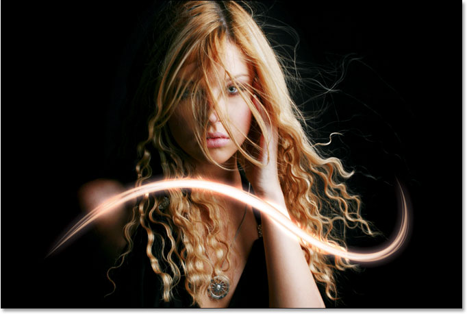
Here’s my result after adding a second light streak to my photo:
Here’s my final result after editing the layer styles on “Layer 2″ and changing the color of my second light streak slightly, using colors I sampled from the woman’s hair:
Clicking on the “New Layer” icon.
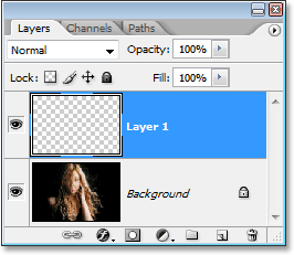
This adds a new blank layer, which Photoshop names “Layer 1″, above our Background layer:
A new layer appears above the Background layer.
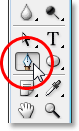
Step 2: Select The Pen Tool
As I mentioned at the beginning, we’re going to create our light streaks by drawing paths and then stroking the paths with a brush. To draw paths, we need the Pen Tool, so select it from the Tools palette. You can also press the letter P to select it with the keyboard shortcut:
Select the Pen Tool.
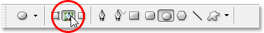
Step 3: Select The “Paths” Option In The Options Bar
Photoshop gives us three different things that we can do with the Pen Tool. We can use it to draw vector-based shapes, we can draw paths with it (which is what we want to do), and we can draw pixel-based shapes. We select between these three options by clicking on their icons up in the Options Bar at the top of the screen. You’ll see three little square icons grouped together on the left side of the Options Bar. Click on the icon in the middle, which is the Paths option:
Click on the “Paths” icons in the Options Bar.
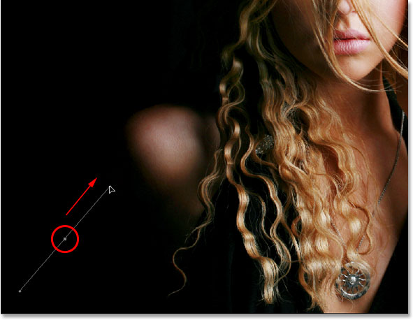
Step 4: Draw A Path Where You Want The First Light Streak To Appear
With the Pen Tool selected and the Paths option chosen in the Options Bar, we’re ready to draw our first path. I want my light streaks to appear in the bottom half of the photo, somewhere around the woman’s shoulders and neck area, so that’s where I’ll draw my first path. You’ll want to add several curves to your path to make the light streak more interesting. I’ll start by clicking somewhere in the bottom left corner of the image to add my first anchor point, then I’ll drag out direction handles in the direction that I want my path to follow. Again, be sure to check out our Making Selections With The Pen Tool tutorial first if what I just said made no sense to you:
Clicking in the document to add an anchor point, then dragging out direction handles.
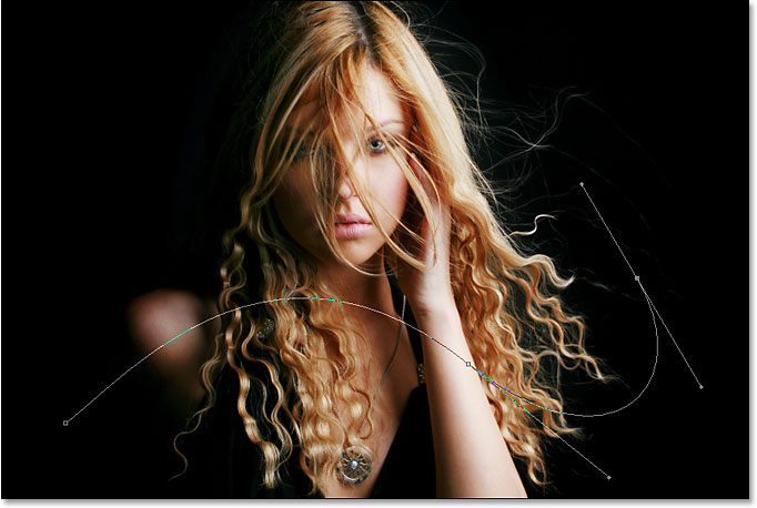
I’ll continue drawing the rest of my first path by clicking and
dragging a couple more times with the Pen Tool to add the rest of my
path segments. I now have my first path running from left to right
across the woman’s shoulders and neck area:
The first path has now been added to the image.
Step 5: Select The Brush Tool
Now that we’ve drawn our first path, the next step is to stroke it with a brush. For that, we’ll need Photoshop’s Brush Tool, so select it from the Tools palette, or simply press the letter B on your keyboard:
Select the Brush Tool.
Step 6: Select The “40 Sampled Tip” Brush
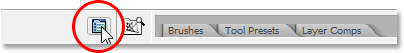
Photoshop comes with several brushes that would work well for our light streak effect, but after trying a few of them out, I’ve found one I like the best. To select it, we’ll need to bring up the Brushes palette. There’s a few different ways to bring up the Brushes palette, and one of them is to click on the Brushes palette toggle icon in the Options Bar at the top of the screen:
Click on the Brushes palette toggle icon to bring up the Brushes palette.
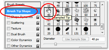
When the Brushes palette appears, click on the words Brush Tip Shape
in the top left corner of the palette. Then, in the Brush tip selection
area on the right, scroll down near the bottom of the list and select
the 40 Sampled Tip brush. It just says “40″ in
the preview area, but if you have Tool Tips enabled in Photoshop’s
Preferences, you’ll see the words “Sampled Tip” appear when you hover
your mouse over the brush:
Click on the words “Brush Tip Shape” in the top left corner, then click on the “40 Sampled Tip” brush in the selection area.
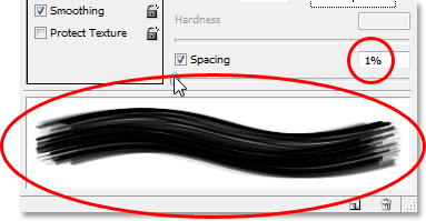
Step 7: Lower The “Spacing” Amount To 1%
Down at the bottom of the Brushes palette, directly above the brush preview area, you’ll see the Spacing option. Whenever you paint with a brush in Photoshop, even though it usually appears as though you’re painting one continuous stroke, what Photoshop is really doing is “stamping” the image over and over again with the brush tip. If the “stamps” are close enough together, they appear as a continuous stroke.
The Spacing option determines how far apart the
stamps will appear, and by default, the option is set to 30% for our “40
Sampled Tip” brush. That’s too much of a space for our effect. Use the
slider bar to lower the Spacing amount all the way down to 1%.
If you look at the brush preview area after lowering the Spacing amount
to 1%, you’ll see that the brush now appears as one continuous stroke:
Lower the “Spacing” amount to 1% to smooth out the appearance of the brush stroke.
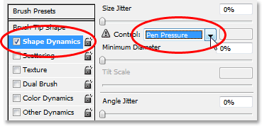
Step 8: Set The Brush Size Control To “Pen Pressure”
If we were to stroke the path with our brush right now, the light streak effect wouldn’t look very good because the brush would appear at the exact same size all along the path. We need the brush to taper off at both ends to create the illusion that the light streak is actually beginning at one end and ending at the other. For that, we’ll need to tell Photoshop to simulate pen pressure for us, as if we were drawing with a pen tablet.Click directly on the words Shape Dynamics on the left of the Brushes palette, directly below “Brush Tip Shape”. Make sure you click directly on the words, not just in the checkbox to the left of the words. Clicking inside the checkbox will enable the Shape Dynamics options but won’t allow us to change any of them. We need to click on the words themselves to get access to the options. Once you’ve clicked on the words, you’ll see the Shape Dynamics options appear on the right of the palette. At the very top, you’ll see the words "Size Jitter" with a slider bar, and directly below the slider bar is the Control option. This is where we get to decide how to control the size of our brush. We want Photoshop to simulate pen pressure, so select Pen Pressure from the Control drop-down menu:
Click directly on the words “Shape Dynamics” on the left, then set the “Control” option on the right to “Pen Pressure”.
Now, at the moment, all we’ve done is told Photoshop that we want to
control the size of our brush according to pen pressure, but what if you
don’t actually have a pen tablet? If you don’t have one connected to
your computer, you’ll see a little warning icon appear to the left of
the word "Control" telling you that a pen tablet is required, but don’t
worry about it. In a moment, we’re going to be telling Photoshop to
simulate pen pressure for us, so for this effect, it makes no difference
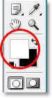
whether you have a pen tablet or not.Step 9: Set Your Foreground Color To White
We have our brush ready to go. Now all we need to do is choose the color we want to paint with. We’re going to want to paint with white, which means we need our Foreground color to be white. Press the letter D on your keyboard to make sure your Foreground and Background colors are reset to their defaults, with black as your Foreground color and white as your Background color. Then press the letter X to swap them, making white your Foreground color:
The Foreground and Background color swatches in the Tools palette. White is now the Foreground color.
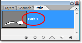
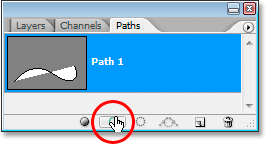
Step 10: Save Your Path
We have our path, we have our brush, and we’ve set our Foreground color to white. We’re ready to create our first light streak! Switch over to Photoshop’s Paths palette, which you’ll find grouped in with the Layers and Channels palettes. You’ll see your path listed, which is currently named “Work Path”, along with a preview of the path on the left, similar to how layers are shown in the Layers palette with their name on the right and a preview area on the left. Whenever you create a new path, Photoshop automatically names it “Work Path”, which means it’s temporary. If you don’t save the path before drawing a new one, the new path will replace the previous one and you’ll have lost it. In many cases, this isn’t a problem, but let’s save our path just in case we want to go back to it later.To save a path, all we need to do is rename it. Simply double-click on the name “Work Path” and Photoshop will pop up the Save Path dialog box, with the suggested name of “Path 1″ already entered for you. Click OK to exit out of the dialog box and Photoshop will rename the path “Path 1″. The path is now saved:
The Paths palette showing the path now saved and renamed “Path 1″.
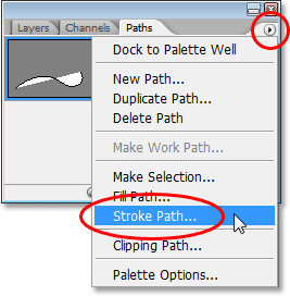
Step 11: Stroke The Path With The Brush
Let’s create our first light streak. Click on the small, right-pointing arrow in the top right corner of the Paths palette, which brings up the Paths palette’s fly-out menu, then select Stroke Path from the list of options:
Select “Stroke Path” from the fly-out menu.
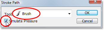
This brings up the Stroke Path dialog box. We want to stroke the path with our brush, so make sure the Tool option is set to Brush. Then, to tell Photoshop to simulate pen pressure for us, click inside the checkbox to the left of the words Simulate Pressure:
Set the “Tool” option to “Brush” and make sure “Simulate Pressure” is selected.
Click OK to exit out of the dialog box and Photoshop will stroke the
path with the brush, creating our first light streak. Notice how the
brush stroke tapers off at both ends thanks to that “Simulate Pressure”
option:
The image after stroking the path with the brush.
If you think your brush stroke is either too thick or too narrow, simply press Ctrl-Z (Win) / Command-Z (Mac) to undo the stroke, then make your brush larger or smaller by pressing either the left or right bracket keys
on your keyboard. The left bracket key makes the brush smaller, and the
right bracket key makes it larger. Try again once you’ve resized your
brush.We’ve added our first light streak, but it doesn’t look much like a light streak at the moment. It looks like a fancy white brush stroke, which is exactly what it is. To make it look more like a light streak, we need to add some color and some glow effects, and for that, we’ll use a couple of simple layer styles.
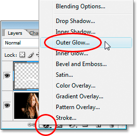
Step 12: Add An “Outer Glow” Layer Style
Switch back over to your Layers palette. You’ll see your white brush stroke in the preview area of "Layer 1". Click on the Layer Styles icon at the bottom of the Layers palette and select Outer Glow from the list of layer styles that appears:
Add an “Outer Glow” layer style in the Layers palette.
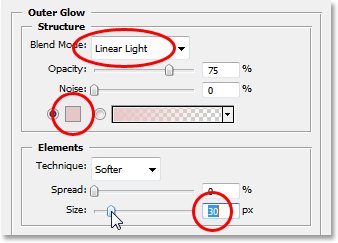
This brings up Photoshop’s Layer Style dialog box set to the Outer Glow options in the middle column. Change the Blend Mode option at the top to Linear Light,
which will give us a much more intense glow than what we’d normally
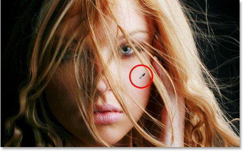
get. Then choose a color for your glow by clicking on the small color swatch directly below the word “Noise”. This will bring up Photoshop’s Color Picker.
You can either choose your color from the Color Picker, or if you
prefer, you can sample a color directly from the image. To sample a
color, simply move your mouse cursor over the image. You’ll see your
mouse icon turn into the Eyedropper icon. Move
the eyedropper over the color you want to sample, then click to sample
it. I’m going to sample a light area of the woman’s skin to use as my
outer glow color:
Sampling a color from the image to use as the color for the outer glow.
Once you’ve chosen your color, click OK to exit out of the Color Picker. Lastly, increase the Size of the outer glow to somewhere around 30 pixels. You may need to raise or lower that amount depending on the size and resolution of your image:
Change the blend mode, color and size of the outer glow.
Don’t exit out of the Layer Style dialog box just yet because we
still have one more layer style to add. Here’s how my light streak looks
so far after adding my outer glow:
The image after applying an outer glow to the light streak.
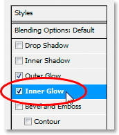
Step 13: Add An “Inner Glow” Layer Style
We’ve added an outer glow layer style to our light streak. Now let’s add an inner glow style. With the Layer Style dialog box still open, click on the words Inner Glow on the left of the dialog box, directly below “Outer Glow”:
Select “Inner Glow” on the left of the Layer Style dialog box.
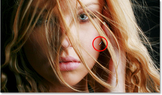
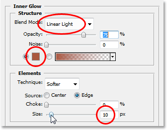
You’ll see the Inner Glow options appear in the middle column of the dialog box. Once again change the Blend Mode option at the top to Linear Light. Then click on the color swatch
below the word “Noise” and either choose a color from the Color Picker
or, as I did with the outer glow, sample a color directly from the
image. I’m going to sample a darker area of the woman’s skin for my
inner glow color:
Sampling a darker skin color to use as the color for the inner glow.
Once you’ve chosen the color for your inner glow, click OK to exit out of the Color Picker. Finally, increase the Size of your inner glow to around 10 pixels. As with the outer glow, you may need to play around with this value a bit depending on the size and resolution of your image:
Change the blend mode, color and size of the inner glow.
Click OK when you’re done to exit out of the Layer Style dialog box. Your light streak should now have an intense glow to it:
The light streak now appears with a bright, colorful glow.
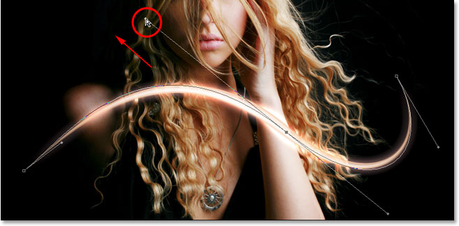
That thin dark line we’re seeing through the middle of our light
streak is the path. Don’t worry, it won’t be there when we’re done.Step 14: Edit The Path To Create A Slight Variation Of It
Let’s make our light streak a bit more interesting by adding a couple more streaks to it. We can do that easily by simply editing our path to create some slight variations of it and then stroking each variation with our brush. Switch back to your Paths palette so we can edit our path. Then, hold down your Ctrl (Win) / Command (Mac) key and move your mouse cursor directly over any part of the path. As soon as it’s over the path, you’ll see the cursor turn into a white pointer, which means you now have temporary access to Photoshop’s Direct Selection Tool, which is the tool we need to edit our path:
Hold down “Ctrl” (Win) / “Command” (Mac) and
move the mouse cursor directly over the path to temporarily access the
Direct Selection Tool (white pointer).
Click on the path with the Direct Selection Tool to select it, then
make some minor adjustments to the path to create a slightly different
path. You can drag an anchor point to a slightly different spot, or move
direction handles to adjust the curves of the path, or even drag a path
segment to a slightly different position. Just don’t touch the anchor
points at either end of the path because we want each variation we
create to begin and end at the exact same spot. So other than those two
anchor points, the rest of the path can be edited any way you like.
We’re not looking for major changes to the path. Small, subtle changes
are all we need.
Here, I’ve changed the two main curves of my path
slightly by dragging the two direction handles extending out from my
middle anchor point. You can see how the curves of the path no longer
exactly match the curve of the first light streak:
Create a slight variation of the initial path by moving anchor points, direction handles or path segments.
We can now stroke this variation of the path with our brush. But
before we do, we’ll probably want to use a slightly smaller brush this
time, so press the left bracket key on your keyboard a couple of times to make the brush a bit smaller.To stroke the variation of our path, there’s no need to go through the hassle of selecting “Stroke Path” from the Paths palette’s fly-out menu like we did last time. Simply click on the Stroke Path icon at the bottom of the Paths palette:
Click on the “Stroke Path” icon at the bottom of the Paths palette.
Photoshop strokes the new path we created with our brush. Since we’re
still working on the same layer in the Layers palette, the Outer Glow
and Inner Glow layer styles are automatically applied to our new light
streak:
The new path has now been stroked with the brush, and the layer styles are automatically applied to it.
Step 15: Create A Couple More Path Variations And Stroke Them With The Brush
Repeat the previous step one or two more times to create more variations of the path and stroke each one with the brush. Try changing the size of the brush each time using the left and right bracket keys to add even more interest to the light streak. If you don’t like the brush stroke you just added, simply press Ctrl+Z (Win) / Command+Z (Mac) to undo it, then re-edit the path and try again.If you want to see what your light streak looks like without the path blocking your view, simply click anywhere in the empty area below the path in the Paths palette. This will deselect the path and hide it from view. To see the path again, click on it in the Paths palette. You’ll need to have your path visible any time you want to stroke it with your brush. If the path is not visible, the icons at the bottom of the Paths palette become grayed out and unavailable.
Here’s my image after editing my path a couple
more times and stroking each new path variation with the brush. Again,
since we’re still working on the same layer, “Layer 1″, in the Layers
palette, the Outer Glow and Inner Glow layer styles are automatically
applied to each new brush stroke. I’ve hidden my path from view so we
can see more easily what the light streak now looks like with all its
different variations:
The first light streak after adding a few variations to it.
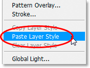
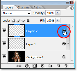
Step 16: Copy The Layer Styles On “Layer 1″
And with that, we’ve created our first light streak! You’re probably going to want to add at least one more to your photo, and it’s a good idea to place each light streak on its own layer, but we can cut down on some of the work we’ll need to do by copying the layer styles we’ve already applied to our first light streak and simply pasting them onto each new layer we create. Switch back over to your Layers palette. You should still have “Layer 1″ selected. Go up to the Layer menu at the top of the screen, choose Layer Style, and then choose Copy Layer Style:
With “Layer 1″ selected, go to Layer > Layer Style > Copy Layer Style.
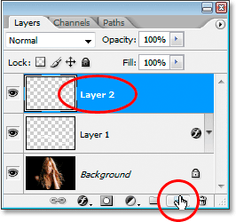
Step 17: Add A New Blank Layer
Click on the New Layer icon at the bottom of the Layers palette to add another blank layer. Photoshop will add the new layer above “Layer 1″ and automatically name it “Layer 2″:
Add a new blank layer above “Layer 1″.
Step 18: Paste The Layer Styles Onto The New Layer
With the new layer selected, go back up to the Layer menu at the top of the screen, choose Layer Style once again, and this time, choose Paste Layer Style:
Go to Layer > Layer Style > Paste Layer Style.
The Outer Glow and Inner Glow styles from “Layer 1″ are now added to
“Layer 2″ and will automatically be applied to the next light streak we
create!Step 19: Add Another Light Streak
With a new layer added and the layer styles from “Layer 1″ already applied to the new layer, we can easily create a second light streak. Simply draw a new path with the Pen Tool, save the path if you want by renaming it “Path 2″ (or whatever you want to name it), then stroke the path with the brush. Once you’ve created the main light streak, hold down Ctrl (Win) / Command (Mac) to access the Direct Selection Tool and edit the path, moving anchor points, direction handles and/or path segments to create a few slight variations of it, and then stroke each variation with the brush, using a different brush size each time.Here’s my result after adding a second light streak to my photo:
The image after adding a second light streak.
If you don’t want both light streaks to be the same color, you can
easily change the colors simply by editing the layer styles. Let’s say I
want my second light streak to be a different color. To edit the layer
styles, all I need to do is double-click on the Layer Style icon on the far right of “Layer 2″:
Double-click on the Layer Style icon to edit the layer styles for that layer.
This will pop open the Layer Style dialog box for me. All I’d need to do is click on the words Outer Glow
on the left side of the dialog box, which brings up the Outer Glow
options in the middle column, then click on the color swatch and choose a
new color either from the Color Picker or by sampling a different color
from the image. Click OK to exit out of the Color Picker, then click on
the words Inner Glow on the left to access the
Inner Glow options. Click the color swatch, choose a new color, click OK
to exit out of the Color Picker, then click OK to exit out of the Layer
Style dialog box. You can edit the colors of the light streaks any time
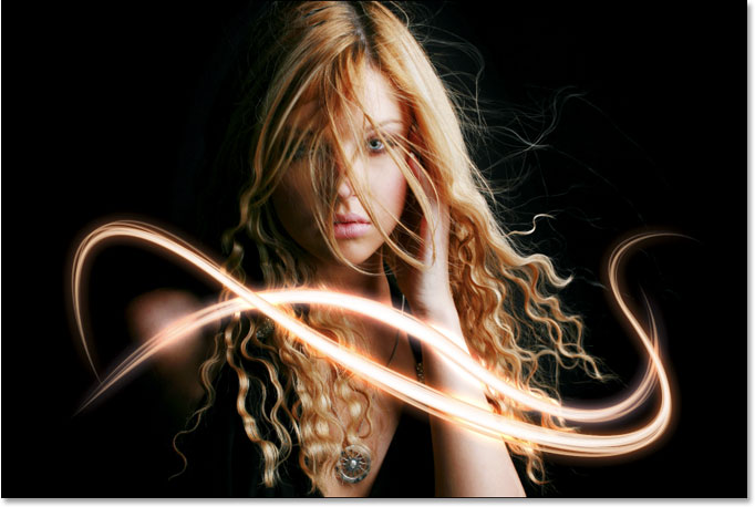
you want simply by editing the layer styles.Here’s my final result after editing the layer styles on “Layer 2″ and changing the color of my second light streak slightly, using colors I sampled from the woman’s hair:
The final result.
 Duplicate gambar pada layer pallete dengan menekan Ctrl + J pada keyboard. Pada layer background isikan dengan warna #e1e1e1
 Kembali pada layer paling atas bernama “Layer 1″ beri border berwarna
putih dengan cara Edit > Stroke dan isikan width dengan 5px atau
lebih besar jika diperlukan.
Kembali pada layer paling atas bernama “Layer 1″ beri border berwarna
putih dengan cara Edit > Stroke dan isikan width dengan 5px atau
lebih besar jika diperlukan.

 Tekan Enter untuk mengakhiri, pilih kembali edit > transform >
warp lalu tarik ujung-ujung warp untuk membuat efek lipatan. Disini saya
membuatnya untuk bagian sudut kiri atas.
Tekan Enter untuk mengakhiri, pilih kembali edit > transform >
warp lalu tarik ujung-ujung warp untuk membuat efek lipatan. Disini saya
membuatnya untuk bagian sudut kiri atas.
 Tekan enter untuk mengakhiri dan dengan hal yang serupa buat kembali efek lipatan pada bagian lain.


Buat layar baru dibawah Layer 1 untuk membuat bayangan bawah terlebih dahulu, pilih pentool pada toolbox lalu buat objek untuk bayangan seperti berikut.
 Beri sedikit efek gaussian blur di filter > blur > gaussian blur. Lalu turunkan sedikit opacitynya
 Kembali dengan pen tool, trace kembali pada bagian bawah foto untuk membuat bayangan.
 Beri efek gaussian blur dan kurangi opacitynya.
 Buat kembali layer (masih dibawah “Layer 1″) untuk membuat bayangan,
pilih brush tool pada toolbox. Kecilkan ukuran brush dan pastikan
hardnessnya menjadi 0% lalu brush lembut pada bagian bawah.
Buat kembali layer (masih dibawah “Layer 1″) untuk membuat bayangan,
pilih brush tool pada toolbox. Kecilkan ukuran brush dan pastikan
hardnessnya menjadi 0% lalu brush lembut pada bagian bawah.

 Lanjut dengan memberikan bayangan pada lengkungan putih yang baru
saja kita buat. Buat sebuah layer baru dan pilih layer > create
clippping mask. Terlihat bahwa layer baru akan lebih menjorok kekanan.
Lalu dengan brush lembut, brush bagian samping pada lengkungan gambar
untuk membuat bayangan hitam.
Lanjut dengan memberikan bayangan pada lengkungan putih yang baru
saja kita buat. Buat sebuah layer baru dan pilih layer > create
clippping mask. Terlihat bahwa layer baru akan lebih menjorok kekanan.
Lalu dengan brush lembut, brush bagian samping pada lengkungan gambar
untuk membuat bayangan hitam.
 Lakukan hal yang sama pada lengkungan bagian bawah.


Pilih Gradient tool pada toolbox photoshop dan setting gradient seperti yang nampak pada gambar dan buat gradient dengan cara klik dari tengah dan tarik tanpa melepas mouse kebagian pinggir.
 Turunkan juga opacity gradient yang baru kita buat hingga tersisa
38%. Dan berikut hasil yang telah kita desain pada tutorial ini.
Turunkan juga opacity gradient yang baru kita buat hingga tersisa
38%. Dan berikut hasil yang telah kita desain pada tutorial ini.
 Buat juga dengan ide dan gaya anda sendiri.


kita akan mencoba membuat foto dengan efek foto robek. Dan inilah langkah-langkahnya…………….
Selamat belajaaarrrr….!!!!
Pada gambar ini, foto saya potong menjadi dua bagian dengan seleksi kemudian diubah letak layernya sehingga nampak terpisah. Untuk membuat kesan lebih dramatis saya beri efek bayangan.
Bukalah gambar yang akan Anda olah dengan Photoshop. Di sini saya menggunakan foto saya……. J
kalau mau di save silahkan……. J
 Langkah 2
Buatlah seleksi pada gambar dengan menggunakan lasso tool. Buatlah agar seleksinya memotong sebagian dari gambar hingga ke salah satu tepinya , lebih jelasnya bisa dilihat pada gambar ilustrasi tutorial dibawah ini.
 Langkah 3
Simpan hasil seleksinya, dengan memilih menu Select > Save Selection.
 Langkah 4
Pilih channel hasil seleksi pada palet channel.
 Langkah 5
Pilih menu Filter > Pixelate > Crystalize. Isikan nilai 3 (ukurannya bisa disesuaikan sendiri, namun jika slider digeser minimalnya tetap cuma 3). Klik OK. Tujuan langkah ini untuk membuat tepian seleksi menjadi tidak rata secara otomatis.
 Langkah 6
Klik channel RGB. Langkah 6 dan 7 ini tujuannya agar kita kembali ke channel seperti awal namun sudah mempunyai seleksi yang tidak rata.
 Langkah 7
Tekan Ctrl + J, tujuannya untuk membuat duplikat hasil potongan seleksi.
Langkah 8
Klik layer Background (yang masih merupakan foto asli dan belum dipotong). Tekan Ctrl + J. Ini akan membuat layer Background copy.
 Langkah 9
Ctrl + klik pada nama layer 1 (yang merupakan layer hasil potongan). Layer yang aktif masih tetap pada layer Background copy.
Langkah 10
Sekarang tekan tombol Delete. Ini untuk menghapus area yang berada dalam seleksi. Kemudian hilangkan seleksi, dengan cara memilih menu Select > Deselect.
Langkah 11
Klik atau pilih layer Background. Isi layer ini dengan warna putih. Caranya dengan memilih menu Edit > Fill. Pada bagian Use=White, Opacity=100%.
 Langkah 12
Aktifkan atau pilih layer 1. Atur ukuran dan posisinya dengan cara memilih menuEdit > Free Transform. Begitu juga dengan layer Background copy.
 Langkah 13
Untuk menambah kesan hasil robekan, bisa ditambahi dengan efek bayangan. Pada tutorial Photoshop ini saya gunakan Layer > Layer style > Drop shadow.
 Catatan:
Jika Anda ingin seluruh gambar bisa ditampilkan sehingga bagian yang
terputar pada langkah 12 tadi tidak nampak terpotong, caranya dengan
Anda lakukan pilih menu Image > Reveal All. Berikut ini gambar hasil
pembuatan efek foto robek……. J
Catatan:
Jika Anda ingin seluruh gambar bisa ditampilkan sehingga bagian yang
terputar pada langkah 12 tadi tidak nampak terpotong, caranya dengan
Anda lakukan pilih menu Image > Reveal All. Berikut ini gambar hasil
pembuatan efek foto robek……. J
 Selamat mencoba dan berkreasi dengan Photoshop.,,,,,,,,, !!!!!!

Lock this level to be sure you’ll don’t move the image around while working on it. Create a new layer.

Now select a visible color for the stroke, empty fill (1). Pick up the Pen Tool (2). Choose a proper stroke weight (you can change it later) (3). Create the first line following the picture in the point you want to create the grid effect (4). Create a second line in the point you want the grid effect to finish (5). As you can see, my lines are going in random direction where the leg is no more visible. This for having a “veil” effect later.

Select both the lines and go tu Object-> Blend-> make. By default value you’ll see a single line in the middle of the other two. We’re gonna change this in the next step.

Object->Blend->Blend Options

Enable Preview and select Specified Steps as Spacing and set a value you think it’s fine. The result should be like this. You can also use Specified distance instead, as Spacing.

Now create two more lines, in the other direction, for the horizontal lines of the grid using the same process.

As you can see, the horizontal lines are going a bit out of the shape. Let’s fix this. Create a new line following the shape of the leg (or the other part of the body you choose). Select this new line and. holding SHIFT, the blend of the horizontal lines (you just have to click one of the lines of the blend)…

….now Object->Blend->Replace Spine. Thanks to this your blend should follow the shape in a better way.

Now pick up the Direct Selection Tool (1). Clicking on the vertex of the lines you blended move them to create the veil effect (2). Just select them one by one and move them around. You have to try and try to find the perfect disposition.

Let’s get that hair to float a bit more. Take the Twirl Tool (1) (it’s usually hidden by the Warp Tool. Click and keep it clicked to see the other tools). Choose the dimension, the same for height and width to have it round. I can’t tell you the exact dimensions because they depend by the size of the picture your working on. You have to try.

Now change all the stroke’s color. Pick up one single line and go to Select->Same->Stroke color.

Choose Black as Stroke’s color.
Keeping selected the lines you can change the stroke weight (1) if you want ‘em more thin. Hide the pciture layer (2). Save the document (3).

Open the picture in Photoshop. Filter–>Extract
Using the marker along the shape of your girl (or the thing you’re working on) and the bucket to fill it, click ok and extract it from the background. For this step you can use also other ways to cut-out the figure.

Paste it on a black new document. I choosed 1280×1024 since I wanna create a wallpaper in this case. Adjust the contours. It could be useful to duplicate once or twice the girl layer to adjust the opacity in certain points. If you do that don’t forget to merge those layers.
Add an Outer Glow (Fx button in the bottom of the layers palette). OK.

Duplicate this layer. Select the one down. Filter->Blur->Radial blur. Blur Method: Zoom. Display: Best. Choose a big amount. OK.

Duplicate the blurred layer and for the one on top set the layer’s blending mode on Vivid Light.

Add another Outer Glow on the blurred layer on the bottom. Choose a strong light color. Do the same for the blurred layer on top, but with a very light color (almost white).

Oper the illustrator document with grids. If you didn’t resize it you should be able to copy and paste it on your image without any transformation. Otherwise select the grid layer, CTRL+T and make it match on your picture.

Keep working on the layer with the grids. CTRL+I to invert colors. Now select the layer with the girl (not blurred) and with a soft eraser erase some area where the grids are. In my case legs, a shoulder and an arm.
Duplicate twice the grid layer and set all the three layers as Overlay. Now, layers (1) and (2) stay white as they are, and select layer (3) and CTRL+I to invert color.

Create a new layer right above the black background. Draw an elipse with a very large and soft brush, in a bright color. Add a new layer above this one. Press D to reset colors. Go to Filter-> Render-> Clouds. Set this layer as Overlay.

You can add some text, and this is all….
Sekarang simak tutornya :
1] Buka dulu PS nya
2] Setelah itu, klik tab File, kemuian klik open untuk membuka gambar yang akan diedit

3] Buka tempat penyimpanan file gambar yang akan diedit, kemudian pilih gambarnya, lalu klik open

4] Gambar/foto yang sudah dipilih akan tampak seperti pada gambar dibawah ini

5] Pilih tab File, kemudian klik New untuk membuat Kanvas baru.

6] Kan muncul jendela baru yang namanya New, disitu kita bisa mengatur ukuran kanvasnya. kalau ukuran kanvas buat posterku sih lebar 600px , tinggi 800px , tapi kalian juga bisa mengatur ukurannya sesuai keinginan kalian masing-masing.

7] Setelah itu, maka akan muncul kanvas baru seperti yang nampak pada gambar dibawah ini

8] Sekarang, drag Background-nya ke kanvas baru dengan cara double klik pada background kemudian seret ke kanvas baru. ( supaya lebih jeas, lihat gambar)

9] Hasilnya akan tampak seperti gambar dibawah ini.

10] Sekarang, drag foto (png) nya ke canvas baru, caranya sama seperti no. 8

11] Hasilnya akan nampak seperti gambar dibawah ini

12] Beri judul posternya dengan cara mengklik icon type tool kemudian tempatkan pada area poster yang akan diberi text. Supaya lebih jelas, lihat gambar dibawah.

Nb : font yang aku gunakan adalah “Copperlate Gothic Bold”
13] Hias Text nya dengan cara mengklik add a layer style lalu pilih blending option.

14] Pada jendela layer style, beri tanda cek (pilih) gradient overlay. Ubah warna gradient menjadi Light purple . setelah itu ubah angle menjadi -84 . lalu klik OK

15] Hasilnya akn tampak seperti gambar dibawah ini.

16] Setelah itu, tambahkan text #kaloMau . caranya sama seperti no 12. Maka, hasilnya akan seperti ini

17] Buat garis-garis menggunakan pencil tool Hingga akan nampak seperti gambar dibawah ini.

Nb : agar garis yang dibuat menjadi lurus, sebaiknya saat membuat garis sambil menekan tombol Shift pada keyboard.
18] Tambahkan nama Cast-nya . Supaya tulisan nama cast nya lebih jelas, Stroke tulisannya dengan cara klik add a layer style -> pilih blending option -> Beri tanda cek (pilih) stroke -> klik OK.

19] Buka file Psd coloringnya.
Pada canvas Psd coloringnya, klik kanan pada set 1 , lalu pilih duplicate layer set.

20] Lalu akan muncul jendela Duplicate layer Style.
Pada pilihan Document, ganti dengan nama dokumen poster yang sedang kalian buat. Setelah itu klik OK

21] Jadinya akan terlihat seerti pada gambar dibawah ini .

22] Satukan semua layer dengan cara tekan tombol Shift+Ctrl+E pada keyboard , agar semua layer menjadi Background.
Dan… posternya sudah jadi

23] Jangan lupa simpan posternya dengan cara pilih tab file -> Save as -> Save . simpan dengan format Jpeg.
Hal yang perlu diperhatikan adalah, saat menyimpan gambar yang telah diedit jangan menyimpannya dengan format Psd, kecuali kalo kalian memang ingin membuat Psd file.
Suaya lebih jelas, lihat gambar dibawah ini :

Fiuhhh… Selesai juga ni tutor !!!
Gimana nih readers…. dah bisa belum ? kalo masih ada hal yang kurang jelas, tanya saja di kotak komentar .
1. Buat dokumen baru >> File >> New atau Ctrl+N
2. setelah itu buat ukuran A4 21x29.7 dengan Resolusi 300 Dpi dan Color Mode menggunakan CMYK

gambar : setting Poster di Photoshop
2. Warnai Background menggunakan Paint Bucket Tool. Lalu set Foreground

gambar : letak paint bucket tool dan set foreground
Setting Warna Foreground, Gunakan warna orange kodenya C: 0 M: 58 Y: 99 K: 0 alasannya warna orange memiliki sifat semangat, ceria jadi pada tema poster semangat jiwa pemuda sangat cocok sekali

gambar : setting warna CMYK (warna Orange)
Setelah itu klik OK. Lalu klik pada lembar kerja sehingga warna canvas Poster kita menjadi Orange

gambar : background poster orange
3. Gunakan Brush Tool (B) warna putih buatlah pola seperti gambar dibawah ini

gambar : brush ke canvas
4. Kemudian buatlah Layer baru pada layer tersebut buatlah bidang seperti dibawah ini menggunakan Polygon Lass Tool jika sudah beri warna putih

gambar : Polygon Lass Tool
5. Setelah itu duplikat gambar dengan cara Klik Kanan layer >> Duplicate Layer

gambar : duplicate layer
6. Klik Menu Utama pilih Edit >> Free Transform titik tengah tersebut pindah ke bagian sudut kiri bawah untuk melakukan rotasi pada 1 sumbu

gambar : transform
kemudian putar ke arah kiri

gambar : putar bangun
Langkah di atas di ulangi sampai membentuk gambar di bawah ini

gambar : background poster
7. Pada Layer gambar di atas klik kiri pada layer (sambil menahan Ctrl) fungsinya yaitu membuat seleksi pada gambar

gambar : seleksi layer
Kemudian klik Menu Select >> Modify >> Feather (untuk versi CS5) isi dengan nilai 5 pixel

gambar : setting Feather Radius
Setelah itu kembali ke layer gambar di atas tadi pada layer style dari Normal ubahlah menjadi Soft Light

gambar : soft light
8. Langkah selanjutnya yaitu memasukan ilustrasi gambar pendukung sebagai objek utama pada poster ini letakkan posisi ilustrasi gambar seperti gambar di bawah ini
Caranya File >> import >> Pilih gambar (maskot.png) >> ok, drag ke area kerja poster

gambar : poster setengah jadi ^_^
9. Klik kanan pada layer ilustrasi gambar >> pilih Blending Options
Pada Layer style atur bagian Sytle Outer Glow fungsinya memberi efek bersinar pada objek gambar

gambar : setting outer glow gambar ilustrasi poster
Langkah selanjutnya yaitu mengatur font buatlah kalimat PRESTASIKU (beri warna merah) Untuk ( beri warna abu-abu) Masa Depan (beri warna orange). Lanjut ke efek font Warp Text

gambar : letak setting text
Atur seperti gambar dibawah ini

gambar : warp text poster
buatlah kalimat Aku untuk (beri warna hitam) Indonesia ( beri warna hijau) Aku (beri warna merah). Lanjut ke efek font Warp Text atur seperti gambar dibawah ini

gambar : setting font melengkung
Kemudian klik salah satu Layer text >> Blending Options atur Drop Shadow seperti gambar dibawah ini

gambar : setting drop shadow
atur Outer Glow seperti gambar dibawah ini

gambar : setting outer glow
Klik kanan pada Layer text yang barusan di atur Blending Optionsnya >> Copy Layer Style

gambar : copy layer sytle
Kemudian Klik kanan pada Layer text yang satunya >> Paste Layer Style

gambar : paste layer style
Hasilnya kurang lebih seperti ini

gambar : poster prestasiku "aku untuk Indonesia"


Langkah 1
Mulailah dengan kanvas gelap # 080.808 dari 1600 × 2.300 piksel (300dpi). Saya ingin bekerja pada resolusi tinggi sehingga Anda menyimpan gambar Anda lebih tajam, lebih fleksibel dan optimal untuk mencetak tujuan jika diperlukan.
Langkah 2
Untuk membuat latar belakang sedikit lebih menarik dan memberikan beberapa "tubuh" Saya menggunakan tekstur kertas bebas bernoda. Desaturate tekstur, set blending mode Anda terhadap cahaya keras dan tarik opacity ke 30%.

Langkah 3
Menambahkan gambar Nebula dalam layer baru di atas tekstur, flip dan menggunakan Hue Saturation (192, 26, 0). Ini harus memberikan warna biru seperti yang ditunjukkan. Sekarang menggunakan alat masker Anda untuk berbaur gambar di latar belakang. Hanya kiri, kanan dan bawah harus bertopeng (lihat gambar).

Langkah 4
Selanjutnya adalah menambahkan gambar cakrawala. Sama seperti langkah sebelumnya, desaturate gambar dan menggunakan cahaya lembut pada blending mode Anda. Saya digandakan gambar untuk membuatnya menunjukkan sedikit lebih detail. Gunakan gradient tool Anda untuk menutupi gambar dari atas. Kita hanya perlu melihat gunung / batu dan sepotong kecil langit.

Langkah 5
Pentool keluar stok wanita dan meletakkannya di nebula. Gunakan sikat yang halus dengan opacity 30% untuk membuat bagian-bagian ditandai lembut dan perpaduan mereka sedikit lebih ke latar belakang. Bagian bawah dari wanita harus dihapus. Saya juga menggunakan kekuatan noda alat 30%) untuk retouch wajah dan lengan.

Langkah 6
Gunakan Pentool Anda untuk menggambar bentuk di pipi wanita itu. Warna yang digunakan dan gaya lapisan ditunjukkan pada gambar. Satu-satunya hal tersisa untuk dilakukan adalah memberikan bentuk perpaduan modus cahaya lembut dan drop shadow di atas dengan opacity 25%. Untuk membuat campuran bentuk yang lebih Anda dapat membuat masker dan menggunakan sikat yang halus di sisi kiri bentuk.

Langkah 7
Mari kita tambahkan beberapa detail lagi. Dalam sebuah layer baru menggunakan sikat putih lembut (20%) untuk membuat ruang ditandai dalam lingkaran merah sedikit lebih ringan. Hal ini memberikan lebih mendalam dan membuat bentuknya lebih mengkilap. Juga menambahkan stroke sikat dengan Pentool Anda ke bagian atas bentuk.
Gunakan paket tekstur tergores logam untuk menambahkan beberapa goresan ke bentuk. Tempatkan tekstur di kanvas, desaturate dan klip itu pada bentuk seperti yang ditunjukkan pada gambar. Mengatur opacity antara 20-40%.

Langkah 8
Sekarang kita menambahkan tekstur awal logam kita akan menambahkan detail ekstra untuk bentuk. Buatlah pilihan saham chip komputer dan menempatkannya pada bentuk (opacity 85%, blending mode: cahaya lembut). Gunakan alat masker untuk menutupi Anda dalam bentuk. Saya biasanya menggunakan sikat yang halus di sekitar tepi sulit untuk berbaur masuk Akhirnya, saya juga menambahkan dua lapisan di mana saya menggambar stroke biru dan berkilau untuk memberikan lebih mendalam. Untuk membuat stroke di atas bentuk bahkan lebih mengkilap Anda dapat menambahkan gradien radial putih.

Langkah 9
Buat layer baru dan menarik dua bentuk dengan Pentool Anda seperti ditunjukkan pada gambar. Seperti yang kita lakukan sebelumnya lagi menggunakan sikat putih lembut untuk menyorot beberapa bagian dari bentuk. Hanya bentuk atas membutuhkan drop shadow di bagian bawah. Anda dapat membuat masker pada bentuk Anda dan sikat keluar tepi keras bentuk pentooled Anda. Langkah-langkah selanjutnya tekstur berbasis sama seperti yang digunakan pada bentuk biru.

Langkah 10
Jika Anda mengikuti langkah-langkah penggunaan tekstur dan penempatan detil lagi, Anda kami memiliki hasil yang serupa seperti yang ditunjukkan dalam gambar. Untuk membuat karakter lebih "superhero seperti" saya menambahkan cahaya ke matanya. Hanya menggunakan gradien radial di atas mata (warna: # 10bdee) dan mengatur opacity ke 50% dan gaya lapisan ke layar.

Langkah 11
Buat folder bernama penyesuaian warna dan letakkan di bagian atas semua lapisan Anda. Dengan cara itu akan mempengaruhi semua lapisan di bawahnya.
Warna isi:
color: # 020.317, mengatur gaya lapisan ke layar
Selektif warna:
Reds: +37, -10, -33. +30
Kuning: +25, 0, -15, 0
Netral: +5, 0, +2, +2
Blacks: +20, 0, 0, 0
Kecerahan / Kontras:
Brightness: 11
Kontras: 7
Akhirnya menambahkan lapisan tingkat. Ini benar-benar tergantung pada seberapa gelap atau cahaya yang Anda ingin gambar menjadi.

Langkah 12
Pilih lapisan wanita. Gunakan marque atau alat laso untuk membuat pilihan bagian Anda ingin membuat cut dari. Salin seleksi dan tempel di tempat yang sama. Gunakan bayangan batin dan Anda mendapatkan hasil seperti yang ditunjukkan dalam gambar. Untuk bagian lengan saya melakukannya sedikit berbeda. Saya membuat pilihan dan mengisinya dengan warna: # 705e53. Kemudian memberikan bayangan batin.

Langkah 13
Untuk bagian lengan Anda dapat menggunakan langkah-langkah saya untuk menjelaskan bentuk kepala. Hanya hal ditambahkan di sini adalah penempatan simbol listrik. Gambarlah ini dengan Pentool Anda dan mengisinya dengan warna: # FFFFC1. Anda dapat membuatnya jatuh dalam bentuk dengan bayangan batin halus.

Langkah 14
Sisa dari tutorial ini benar-benar sampai dengan imajinasi Anda. Untuk bagian ini, saya menambahkan helikopter dan menggunakan set mempesona penerangan vektor misalnya. Biarkan kreativitas Anda menjalankan apa pun bebas dan add Anda ingin sepotong sampai Anda puas dengan hasil Anda.

Langkah 15
Untuk menyelesaikan itu menambahkan teks. Saya menggunakan balok petir meliputi teks. Untuk melakukan hal ini, hanya menyalin berkas pada kanvas, meletakkannya di atas teks dan mengatur blending mode untuk overlay. Saya menggunakan sikat lembut untuk menutupi bit teks. Font Aku menggunakannya disebut "The Sans".
Untuk menyelesaikan gambar dan membuatnya lebih renyah saya menggunakan smart mempertajam (filter -> mempertajam). Set untuk sekitar 30%. Jangan terlambat itu.

Membuat efek lipatan kertas pada foto dengan photoshop
Langkah 1 : Persiapan awal
Buka terlebih dahulu foto yang ingin kita beri efek lipatan kertas dimenu file>open.Langkah 2 : Membuat lipatan
Langkah selanjutnya kita akan membuat lipatan terlebih dahulu, Awali dengan memiringkan gambar. Pastikan pada Layer 1 lalu pilih edit > transform > rotate dan miringkan gambar seperti gambar berikut.Langkah 3 : Membuat bayangan
Efek lipatan telah selesai kita lakukan, namun tampak menoton jika tidak ada bayangan. Jika anda sepakat mari kita buat sebuah bayangan pada langkah selanjutnyaBuat layar baru dibawah Layer 1 untuk membuat bayangan bawah terlebih dahulu, pilih pentool pada toolbox lalu buat objek untuk bayangan seperti berikut.
Langkah 4 : Perjelas lipatan gambar
Pastikan layer paling atas dalam keadaan aktif, lalu pilih pen tool pada toolbox dan buat bagian putih pada bagian lengkungan foto.Langkah 5 : Bayangan dalam foto
Selanjutnya adalah kembali membuat bayangan hitam yang ada pada foto, buat layer baru diatas “Layer 1″. Buat menjadi clipping mask dengan cara klik Layer > Create clipping mask. Lalu brush dengan lembut pada bagian foto dibawah kedua lengkungan.Langkah 6 : Memperbaiki background
Ikuti langkah berikut ini untuk membuat background gradasi sederhana. Buat layer baru diatas layer “Background”. Reset warna foreground dan background dengan menekan “D” pada keyboard sehingga warna menjadi hitam dan putih.Pilih Gradient tool pada toolbox photoshop dan setting gradient seperti yang nampak pada gambar dan buat gradient dengan cara klik dari tengah dan tarik tanpa melepas mouse kebagian pinggir.
Tentu hasilnya akan lebih bagus jika anda
buat dengan hati-hati dan memperhatikan kaidah datangnya cahaya pada
sebuah objek pada tutorial ini. Share artikel ini jika anda rasa
bermanfaat
TUTORIAL POTOSHOP_"Efek Foto Robek"

kita akan mencoba membuat foto dengan efek foto robek. Dan inilah langkah-langkahnya…………….
Selamat belajaaarrrr….!!!!
Pada gambar ini, foto saya potong menjadi dua bagian dengan seleksi kemudian diubah letak layernya sehingga nampak terpisah. Untuk membuat kesan lebih dramatis saya beri efek bayangan.
Langkah Membuat Efek Foto Robek
Langkah 1Bukalah gambar yang akan Anda olah dengan Photoshop. Di sini saya menggunakan foto saya……. J
kalau mau di save silahkan……. J

Buatlah seleksi pada gambar dengan menggunakan lasso tool. Buatlah agar seleksinya memotong sebagian dari gambar hingga ke salah satu tepinya , lebih jelasnya bisa dilihat pada gambar ilustrasi tutorial dibawah ini.

Simpan hasil seleksinya, dengan memilih menu Select > Save Selection.

Pilih channel hasil seleksi pada palet channel.

Pilih menu Filter > Pixelate > Crystalize. Isikan nilai 3 (ukurannya bisa disesuaikan sendiri, namun jika slider digeser minimalnya tetap cuma 3). Klik OK. Tujuan langkah ini untuk membuat tepian seleksi menjadi tidak rata secara otomatis.

Klik channel RGB. Langkah 6 dan 7 ini tujuannya agar kita kembali ke channel seperti awal namun sudah mempunyai seleksi yang tidak rata.

Tekan Ctrl + J, tujuannya untuk membuat duplikat hasil potongan seleksi.
Langkah 8
Klik layer Background (yang masih merupakan foto asli dan belum dipotong). Tekan Ctrl + J. Ini akan membuat layer Background copy.

Ctrl + klik pada nama layer 1 (yang merupakan layer hasil potongan). Layer yang aktif masih tetap pada layer Background copy.
Langkah 10
Sekarang tekan tombol Delete. Ini untuk menghapus area yang berada dalam seleksi. Kemudian hilangkan seleksi, dengan cara memilih menu Select > Deselect.
Klik atau pilih layer Background. Isi layer ini dengan warna putih. Caranya dengan memilih menu Edit > Fill. Pada bagian Use=White, Opacity=100%.

Aktifkan atau pilih layer 1. Atur ukuran dan posisinya dengan cara memilih menuEdit > Free Transform. Begitu juga dengan layer Background copy.

Untuk menambah kesan hasil robekan, bisa ditambahi dengan efek bayangan. Pada tutorial Photoshop ini saya gunakan Layer > Layer style > Drop shadow.

First of all take a picture you’d like to use, the grid effect works better on naked parts I think.

Create a new document in Illustrator, then on the top menu go to File->Place, find the picture and place it in the document.Lock this level to be sure you’ll don’t move the image around while working on it. Create a new layer.
Now select a visible color for the stroke, empty fill (1). Pick up the Pen Tool (2). Choose a proper stroke weight (you can change it later) (3). Create the first line following the picture in the point you want to create the grid effect (4). Create a second line in the point you want the grid effect to finish (5). As you can see, my lines are going in random direction where the leg is no more visible. This for having a “veil” effect later.
Select both the lines and go tu Object-> Blend-> make. By default value you’ll see a single line in the middle of the other two. We’re gonna change this in the next step.
Object->Blend->Blend Options
Enable Preview and select Specified Steps as Spacing and set a value you think it’s fine. The result should be like this. You can also use Specified distance instead, as Spacing.
Now create two more lines, in the other direction, for the horizontal lines of the grid using the same process.
As you can see, the horizontal lines are going a bit out of the shape. Let’s fix this. Create a new line following the shape of the leg (or the other part of the body you choose). Select this new line and. holding SHIFT, the blend of the horizontal lines (you just have to click one of the lines of the blend)…
….now Object->Blend->Replace Spine. Thanks to this your blend should follow the shape in a better way.
Now pick up the Direct Selection Tool (1). Clicking on the vertex of the lines you blended move them to create the veil effect (2). Just select them one by one and move them around. You have to try and try to find the perfect disposition.
Let’s get that hair to float a bit more. Take the Twirl Tool (1) (it’s usually hidden by the Warp Tool. Click and keep it clicked to see the other tools). Choose the dimension, the same for height and width to have it round. I can’t tell you the exact dimensions because they depend by the size of the picture your working on. You have to try.
Now change all the stroke’s color. Pick up one single line and go to Select->Same->Stroke color.
Choose Black as Stroke’s color.
Keeping selected the lines you can change the stroke weight (1) if you want ‘em more thin. Hide the pciture layer (2). Save the document (3).
Open the picture in Photoshop. Filter–>Extract
Using the marker along the shape of your girl (or the thing you’re working on) and the bucket to fill it, click ok and extract it from the background. For this step you can use also other ways to cut-out the figure.
Paste it on a black new document. I choosed 1280×1024 since I wanna create a wallpaper in this case. Adjust the contours. It could be useful to duplicate once or twice the girl layer to adjust the opacity in certain points. If you do that don’t forget to merge those layers.
Add an Outer Glow (Fx button in the bottom of the layers palette). OK.
Duplicate this layer. Select the one down. Filter->Blur->Radial blur. Blur Method: Zoom. Display: Best. Choose a big amount. OK.
Duplicate the blurred layer and for the one on top set the layer’s blending mode on Vivid Light.
Add another Outer Glow on the blurred layer on the bottom. Choose a strong light color. Do the same for the blurred layer on top, but with a very light color (almost white).
Oper the illustrator document with grids. If you didn’t resize it you should be able to copy and paste it on your image without any transformation. Otherwise select the grid layer, CTRL+T and make it match on your picture.
Keep working on the layer with the grids. CTRL+I to invert colors. Now select the layer with the girl (not blurred) and with a soft eraser erase some area where the grids are. In my case legs, a shoulder and an arm.
Duplicate twice the grid layer and set all the three layers as Overlay. Now, layers (1) and (2) stay white as they are, and select layer (3) and CTRL+I to invert color.
Create a new layer right above the black background. Draw an elipse with a very large and soft brush, in a bright color. Add a new layer above this one. Press D to reset colors. Go to Filter-> Render-> Clouds. Set this layer as Overlay.
You can add some text, and this is all….
[Tutorial Photoshop] Cara Membuat Dark Poster/Horror Cover
Di tutorial ini, ada beberapa file yang aku gunakan, diantaranya adalah :Kalo kalian berminat untuk membuat poster yang sama dengan punyaku, download aja gambar diatas.
- Dark Psd [ Download Disini ]


Sekarang simak tutornya :
1] Buka dulu PS nya
2] Setelah itu, klik tab File, kemuian klik open untuk membuka gambar yang akan diedit

3] Buka tempat penyimpanan file gambar yang akan diedit, kemudian pilih gambarnya, lalu klik open

4] Gambar/foto yang sudah dipilih akan tampak seperti pada gambar dibawah ini

5] Pilih tab File, kemudian klik New untuk membuat Kanvas baru.

6] Kan muncul jendela baru yang namanya New, disitu kita bisa mengatur ukuran kanvasnya. kalau ukuran kanvas buat posterku sih lebar 600px , tinggi 800px , tapi kalian juga bisa mengatur ukurannya sesuai keinginan kalian masing-masing.

7] Setelah itu, maka akan muncul kanvas baru seperti yang nampak pada gambar dibawah ini

8] Sekarang, drag Background-nya ke kanvas baru dengan cara double klik pada background kemudian seret ke kanvas baru. ( supaya lebih jeas, lihat gambar)

9] Hasilnya akan tampak seperti gambar dibawah ini.

10] Sekarang, drag foto (png) nya ke canvas baru, caranya sama seperti no. 8

11] Hasilnya akan nampak seperti gambar dibawah ini

12] Beri judul posternya dengan cara mengklik icon type tool kemudian tempatkan pada area poster yang akan diberi text. Supaya lebih jelas, lihat gambar dibawah.

Nb : font yang aku gunakan adalah “Copperlate Gothic Bold”
13] Hias Text nya dengan cara mengklik add a layer style lalu pilih blending option.

14] Pada jendela layer style, beri tanda cek (pilih) gradient overlay. Ubah warna gradient menjadi Light purple . setelah itu ubah angle menjadi -84 . lalu klik OK

15] Hasilnya akn tampak seperti gambar dibawah ini.

16] Setelah itu, tambahkan text #kaloMau . caranya sama seperti no 12. Maka, hasilnya akan seperti ini

17] Buat garis-garis menggunakan pencil tool Hingga akan nampak seperti gambar dibawah ini.

Nb : agar garis yang dibuat menjadi lurus, sebaiknya saat membuat garis sambil menekan tombol Shift pada keyboard.
18] Tambahkan nama Cast-nya . Supaya tulisan nama cast nya lebih jelas, Stroke tulisannya dengan cara klik add a layer style -> pilih blending option -> Beri tanda cek (pilih) stroke -> klik OK.

19] Buka file Psd coloringnya.
Pada canvas Psd coloringnya, klik kanan pada set 1 , lalu pilih duplicate layer set.

20] Lalu akan muncul jendela Duplicate layer Style.
Pada pilihan Document, ganti dengan nama dokumen poster yang sedang kalian buat. Setelah itu klik OK

21] Jadinya akan terlihat seerti pada gambar dibawah ini .

22] Satukan semua layer dengan cara tekan tombol Shift+Ctrl+E pada keyboard , agar semua layer menjadi Background.
Dan… posternya sudah jadi

23] Jangan lupa simpan posternya dengan cara pilih tab file -> Save as -> Save . simpan dengan format Jpeg.
Hal yang perlu diperhatikan adalah, saat menyimpan gambar yang telah diedit jangan menyimpannya dengan format Psd, kecuali kalo kalian memang ingin membuat Psd file.
Suaya lebih jelas, lihat gambar dibawah ini :

Fiuhhh… Selesai juga ni tutor !!!
Gimana nih readers…. dah bisa belum ? kalo masih ada hal yang kurang jelas, tanya saja di kotak komentar
Membuat Poster "Prestasiku Untuk Masa Depan"
1. Buat dokumen baru >> File >> New atau Ctrl+N
2. setelah itu buat ukuran A4 21x29.7 dengan Resolusi 300 Dpi dan Color Mode menggunakan CMYK
gambar : setting Poster di Photoshop
2. Warnai Background menggunakan Paint Bucket Tool. Lalu set Foreground
gambar : letak paint bucket tool dan set foreground
Setting Warna Foreground, Gunakan warna orange kodenya C: 0 M: 58 Y: 99 K: 0 alasannya warna orange memiliki sifat semangat, ceria jadi pada tema poster semangat jiwa pemuda sangat cocok sekali
gambar : setting warna CMYK (warna Orange)
Setelah itu klik OK. Lalu klik pada lembar kerja sehingga warna canvas Poster kita menjadi Orange
gambar : background poster orange
3. Gunakan Brush Tool (B) warna putih buatlah pola seperti gambar dibawah ini
gambar : brush ke canvas
4. Kemudian buatlah Layer baru pada layer tersebut buatlah bidang seperti dibawah ini menggunakan Polygon Lass Tool jika sudah beri warna putih
gambar : Polygon Lass Tool
5. Setelah itu duplikat gambar dengan cara Klik Kanan layer >> Duplicate Layer
gambar : duplicate layer
6. Klik Menu Utama pilih Edit >> Free Transform titik tengah tersebut pindah ke bagian sudut kiri bawah untuk melakukan rotasi pada 1 sumbu
gambar : transform
kemudian putar ke arah kiri
gambar : putar bangun
Langkah di atas di ulangi sampai membentuk gambar di bawah ini
gambar : background poster
7. Pada Layer gambar di atas klik kiri pada layer (sambil menahan Ctrl) fungsinya yaitu membuat seleksi pada gambar
gambar : seleksi layer
Kemudian klik Menu Select >> Modify >> Feather (untuk versi CS5) isi dengan nilai 5 pixel
gambar : setting Feather Radius
Setelah itu kembali ke layer gambar di atas tadi pada layer style dari Normal ubahlah menjadi Soft Light
gambar : soft light
8. Langkah selanjutnya yaitu memasukan ilustrasi gambar pendukung sebagai objek utama pada poster ini letakkan posisi ilustrasi gambar seperti gambar di bawah ini
Caranya File >> import >> Pilih gambar (maskot.png) >> ok, drag ke area kerja poster
gambar : poster setengah jadi ^_^
9. Klik kanan pada layer ilustrasi gambar >> pilih Blending Options
Pada Layer style atur bagian Sytle Outer Glow fungsinya memberi efek bersinar pada objek gambar
gambar : setting outer glow gambar ilustrasi poster
Langkah selanjutnya yaitu mengatur font buatlah kalimat PRESTASIKU (beri warna merah) Untuk ( beri warna abu-abu) Masa Depan (beri warna orange). Lanjut ke efek font Warp Text
gambar : letak setting text
Atur seperti gambar dibawah ini
gambar : warp text poster
buatlah kalimat Aku untuk (beri warna hitam) Indonesia ( beri warna hijau) Aku (beri warna merah). Lanjut ke efek font Warp Text atur seperti gambar dibawah ini
gambar : setting font melengkung
Kemudian klik salah satu Layer text >> Blending Options atur Drop Shadow seperti gambar dibawah ini
gambar : setting drop shadow
atur Outer Glow seperti gambar dibawah ini
gambar : setting outer glow
Klik kanan pada Layer text yang barusan di atur Blending Optionsnya >> Copy Layer Style
gambar : copy layer sytle
Kemudian Klik kanan pada Layer text yang satunya >> Paste Layer Style
gambar : paste layer style
Hasilnya kurang lebih seperti ini
gambar : poster prestasiku "aku untuk Indonesia"
Membuat Poster Film

Langkah 1
Buatlah sebuah file baru pada adobe photoshop File => New . Dengan ukuran Layer 1168 x 1700 pixel dan Resolusi 300 pixel/inch

Langkah 2 Set Foreground dengan warna Hitam

kemudia pilih Paint Bucket Tool

sehingga layer menjadi berwarna hitam

Pada menu bar pilih menu file => open => source => nature.jpg atau drag langsung gambar tersebut.
Pilih Move Tool

untuk memindahkan image nature.jpg tersebut kedalam layer background. Lalu sesuaikan letaknya seperti dibawah ini

Pada layer 1, pilih menu bar pilih menu Image =>Adjustment
=>Desaturate (Shift + CTRL + U), sehingga image menjadi seperti
dibawah ini

Langkah 3
Pada menu bar pilih menu file =>open =>source => Buildings.jpg atau drag langsung gambar tersebut. Pilih Move Tool

untuk memindahkan image Buildings.jpg tersebut kedalam layer background.
Pada menu bar pilih Edit =>Free Transform (CTRL + T) untuk
membesarkan/mengecilkan ukuran image, kemudian sesuaikan letaknya
seperti dibawah ini, lalu Apply atau tekan Enter

Pada layer 1,
pilih menu bar pilih menu Image =>Adjustment =>Desaturate (Shift +
CTRL + U), sehingga image menjadi seperti dibawah ini kemudian beri
nama layer tersebut dengan “Buildings”

Pilih Zoom Tool

perbesar image tersebut atau CTRL+ + untuk memperbesar gambar
Pada bagian bawah Pallet pilih Add Layer Mask

Set Foreground dengan warna Hitam
Hilangkan visibility layer nature

Pilih Brush Tool

klik kanan, set nilai seperti dibawah ini

Kemudian klik pada Layer Mask building, lalu cat pada area yang
berwarnah putih, dan tinggalkan efek sedikit diatas bangunan seperti
gambar dibawah ini

hidupkan kembali visibility layer
nature sehingga gambar akan terlihat seperti ini

Langkah 4
Kemudian buat layer baru, beri nama gradient dan simpan layer diatas
layer building Setelah itu set Foreground dan Background menjadi default
pilih Gradient Tool

Pada Option Bar ubah setting Gradient Picker yang tadinya Foreground and Background menjadi Foreground to Transparent
Setelah itu Tekan Shift + Klik tahan dan gerakan secara vertikal seperti dibawah ini

(tampilan layer gradient akan seperti dibawah ini akan terlihat apabila visibility layer yang lain dimatikan)

(tampilan apabila seluruh visibility layer hidup)
Langkah 5
Pada menu bar pilih menu file =>open =>source => man1.jpg atau drag langsung gambar tersebut.
Pilih Move Tool
untuk memindahkan image man1.jpg tersebut kedalam layer background,
sehingga terbentuk layer baru, beri nama man1. Klik pada layer man1,
pilih menu layer =>Convert to Smart Object Tekan CTRL + T (Free
Transform), tekan Shift + klik tahan dan sesuaikan ukuran menjadi
seperti dibawah ini

Pada layer man1 klik Add Layer Mask Hilangkan visibility pada layer
selain layer man1, pilih Brush Tool untuk menghapus sebagia daerah
kepala, seperti dibawah ini

Langkah 6
Pada menu bar pilih menu file => open =>source =>. man2.png atau drag langsung gambar tersebut. Pilih Move Tool
untuk memindahkan image man2.png tersebut kedalam layer background,
sehingga terbentuk layer baru, tempatkan layer tersebut dibwah layer
man1, kemudian beri nama man2. Klik pada layer man2, pilih menu layer
=> Convert to Smart Object Tekan CTRL + T (Free Transform), tekan
Shift + klik tahan dan sesuaikan ukuran menjadi seperti dibawah ini

Langkah 7
Pada menu bar pilih menu file => open => source => man3.png atau drag langsung gambar tersebut.
Pilih Move Tool
untuk memindahkan image man3.png tersebut kedalam layer background,
sehingga terbentuk layer baru, tempatkan layer tersebut dibwah layer
man1, kemudian beri nama man3.
Klik pada layer man3, pilih menu layer => Convert to Smart Object
Tekan CTRL + T (Free Transform), tekan Shift + klik tahan dan sesuaikan
ukuran Pilih Edit =>Trasnform =>Flip Horizontal, sehingga image
seperti dibawah ini

Langkah 8
Lakukan langkah ke 7 untuk image woman1.png, sesuaikan menjadi seperti dibawah ini (layer diletakan dibawah layer man2)

Langkah 9
Lakukan langkah ke 7 untuk image woman2.png, sesuaikan menjadi seperti dibawah ini (layer diletakan dibawah layer man3)

Langkah 10
Kemudian pada sisi kanan klik gambar

, kemudian pilih Pallet Options, ubah setting menjadi seperti dibawah, lalu tekan ok.

Buat layer mask pada layer man2, man3, woman1, woman2,
Pilih Brush Tool, atur Size sesuai dengan keinginan, Hardness menjadi
0%, kemudian cat pada bagian sisi-sisi dari gambar man2, man3, woman1,
woman2, sehingga garis potong tidak terlihat, seperti dibawah ini

Langkah 11
Buat layer baru diatas layer man1, beri nama Color Overlay, Pilih Paint Bucket Tool ubah Foreground menjadi seperti dibawah ini

Klik pada layer Color Overlay sehingga tampilan image seperti dibawah ini

Ubah Blending Mode pada layer Color Overlay menjadi “color”, sehingga gambar akan tampak seperti dibawah ini

Buat layer baru tempatkan di antara layer cloud dan layer buildings,
kemudian pilih Adjustment Levels, isikan nilai seperti dibawah ini

Untuk melengkapi poster film tersebut buatlah tulisan dibawah ini dengan
menggunakan Text Tool, sesuaikan fontnya sesuaikan dengan keinginan
anda, dan untuk hasil akhir menjadi seperti dibawah ini
- SELAMAT MENCOBA -
Membuat Poster Film Superhero Teaser
Preview
Mulailah dengan kanvas gelap # 080.808 dari 1600 × 2.300 piksel (300dpi). Saya ingin bekerja pada resolusi tinggi sehingga Anda menyimpan gambar Anda lebih tajam, lebih fleksibel dan optimal untuk mencetak tujuan jika diperlukan.
Langkah 2
Untuk membuat latar belakang sedikit lebih menarik dan memberikan beberapa "tubuh" Saya menggunakan tekstur kertas bebas bernoda. Desaturate tekstur, set blending mode Anda terhadap cahaya keras dan tarik opacity ke 30%.
Langkah 3
Menambahkan gambar Nebula dalam layer baru di atas tekstur, flip dan menggunakan Hue Saturation (192, 26, 0). Ini harus memberikan warna biru seperti yang ditunjukkan. Sekarang menggunakan alat masker Anda untuk berbaur gambar di latar belakang. Hanya kiri, kanan dan bawah harus bertopeng (lihat gambar).
Langkah 4
Selanjutnya adalah menambahkan gambar cakrawala. Sama seperti langkah sebelumnya, desaturate gambar dan menggunakan cahaya lembut pada blending mode Anda. Saya digandakan gambar untuk membuatnya menunjukkan sedikit lebih detail. Gunakan gradient tool Anda untuk menutupi gambar dari atas. Kita hanya perlu melihat gunung / batu dan sepotong kecil langit.
Langkah 5
Pentool keluar stok wanita dan meletakkannya di nebula. Gunakan sikat yang halus dengan opacity 30% untuk membuat bagian-bagian ditandai lembut dan perpaduan mereka sedikit lebih ke latar belakang. Bagian bawah dari wanita harus dihapus. Saya juga menggunakan kekuatan noda alat 30%) untuk retouch wajah dan lengan.
Langkah 6
Gunakan Pentool Anda untuk menggambar bentuk di pipi wanita itu. Warna yang digunakan dan gaya lapisan ditunjukkan pada gambar. Satu-satunya hal tersisa untuk dilakukan adalah memberikan bentuk perpaduan modus cahaya lembut dan drop shadow di atas dengan opacity 25%. Untuk membuat campuran bentuk yang lebih Anda dapat membuat masker dan menggunakan sikat yang halus di sisi kiri bentuk.
Langkah 7
Mari kita tambahkan beberapa detail lagi. Dalam sebuah layer baru menggunakan sikat putih lembut (20%) untuk membuat ruang ditandai dalam lingkaran merah sedikit lebih ringan. Hal ini memberikan lebih mendalam dan membuat bentuknya lebih mengkilap. Juga menambahkan stroke sikat dengan Pentool Anda ke bagian atas bentuk.
Gunakan paket tekstur tergores logam untuk menambahkan beberapa goresan ke bentuk. Tempatkan tekstur di kanvas, desaturate dan klip itu pada bentuk seperti yang ditunjukkan pada gambar. Mengatur opacity antara 20-40%.
Langkah 8
Sekarang kita menambahkan tekstur awal logam kita akan menambahkan detail ekstra untuk bentuk. Buatlah pilihan saham chip komputer dan menempatkannya pada bentuk (opacity 85%, blending mode: cahaya lembut). Gunakan alat masker untuk menutupi Anda dalam bentuk. Saya biasanya menggunakan sikat yang halus di sekitar tepi sulit untuk berbaur masuk Akhirnya, saya juga menambahkan dua lapisan di mana saya menggambar stroke biru dan berkilau untuk memberikan lebih mendalam. Untuk membuat stroke di atas bentuk bahkan lebih mengkilap Anda dapat menambahkan gradien radial putih.
Langkah 9
Buat layer baru dan menarik dua bentuk dengan Pentool Anda seperti ditunjukkan pada gambar. Seperti yang kita lakukan sebelumnya lagi menggunakan sikat putih lembut untuk menyorot beberapa bagian dari bentuk. Hanya bentuk atas membutuhkan drop shadow di bagian bawah. Anda dapat membuat masker pada bentuk Anda dan sikat keluar tepi keras bentuk pentooled Anda. Langkah-langkah selanjutnya tekstur berbasis sama seperti yang digunakan pada bentuk biru.
Langkah 10
Jika Anda mengikuti langkah-langkah penggunaan tekstur dan penempatan detil lagi, Anda kami memiliki hasil yang serupa seperti yang ditunjukkan dalam gambar. Untuk membuat karakter lebih "superhero seperti" saya menambahkan cahaya ke matanya. Hanya menggunakan gradien radial di atas mata (warna: # 10bdee) dan mengatur opacity ke 50% dan gaya lapisan ke layar.
Langkah 11
Buat folder bernama penyesuaian warna dan letakkan di bagian atas semua lapisan Anda. Dengan cara itu akan mempengaruhi semua lapisan di bawahnya.
Warna isi:
color: # 020.317, mengatur gaya lapisan ke layar
Selektif warna:
Reds: +37, -10, -33. +30
Kuning: +25, 0, -15, 0
Netral: +5, 0, +2, +2
Blacks: +20, 0, 0, 0
Kecerahan / Kontras:
Brightness: 11
Kontras: 7
Akhirnya menambahkan lapisan tingkat. Ini benar-benar tergantung pada seberapa gelap atau cahaya yang Anda ingin gambar menjadi.
Langkah 12
Pilih lapisan wanita. Gunakan marque atau alat laso untuk membuat pilihan bagian Anda ingin membuat cut dari. Salin seleksi dan tempel di tempat yang sama. Gunakan bayangan batin dan Anda mendapatkan hasil seperti yang ditunjukkan dalam gambar. Untuk bagian lengan saya melakukannya sedikit berbeda. Saya membuat pilihan dan mengisinya dengan warna: # 705e53. Kemudian memberikan bayangan batin.
Langkah 13
Untuk bagian lengan Anda dapat menggunakan langkah-langkah saya untuk menjelaskan bentuk kepala. Hanya hal ditambahkan di sini adalah penempatan simbol listrik. Gambarlah ini dengan Pentool Anda dan mengisinya dengan warna: # FFFFC1. Anda dapat membuatnya jatuh dalam bentuk dengan bayangan batin halus.
Langkah 14
Sisa dari tutorial ini benar-benar sampai dengan imajinasi Anda. Untuk bagian ini, saya menambahkan helikopter dan menggunakan set mempesona penerangan vektor misalnya. Biarkan kreativitas Anda menjalankan apa pun bebas dan add Anda ingin sepotong sampai Anda puas dengan hasil Anda.
Langkah 15
Untuk menyelesaikan itu menambahkan teks. Saya menggunakan balok petir meliputi teks. Untuk melakukan hal ini, hanya menyalin berkas pada kanvas, meletakkannya di atas teks dan mengatur blending mode untuk overlay. Saya menggunakan sikat lembut untuk menutupi bit teks. Font Aku menggunakannya disebut "The Sans".
Untuk menyelesaikan gambar dan membuatnya lebih renyah saya menggunakan smart mempertajam (filter -> mempertajam). Set untuk sekitar 30%. Jangan terlambat itu.
Finished


0 komentar:
Post a Comment